Starvard University · Data Analysis
Read numbers, find the story, make better decisions. You don't need a statistics degree. You need better questions.

The whole course in brief
Twelve lessons, distilled. Read this and you are already more data-literate than most.
No math beyond arithmetic. A spreadsheet is the only tool you need.
The twelve lessons
Lesson 1
Most people open a spreadsheet and start poking at numbers, hoping something interesting appears. That is backwards. Data analysis begins with a question you actually need answered: "Which of my products makes the most profit per hour of my time?" "Are my customers happier since we changed the policy?" The question tells you which data to collect, which to ignore, and when you are done.
A good question is specific and decidable. "How are sales?" is not a question, it is a mood. "Did sales grow faster than costs last quarter?" is a question with an answer that changes a decision. Write the question down before you touch the data. It keeps you honest later when the numbers tempt you toward a more flattering story.
Bonus: a good question usually fits in one sentence. If yours needs a paragraph, you have three questions wearing a trench coat. Split them up.
Lesson 2
"Our customers spend $50 on average." Sounds tidy. But it could mean everyone spends about $50, or it could mean half spend $5 and half spend $95. Same average, completely different business. The average hides the shape of the data, and the shape is where the decisions live.
Always ask for the spread: the minimum, the maximum, and what the middle looks like. Better yet, look at a simple histogram, a bar chart of how many values fall in each range. It takes thirty seconds to make and it instantly shows whether you have one group, two groups, or a few wild outliers dragging the average around.
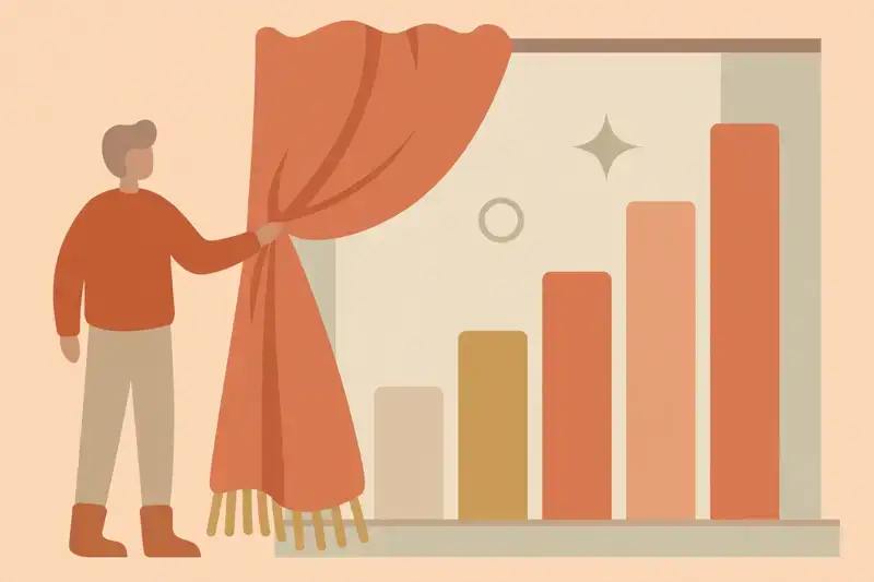
The median, the middle value when everything is lined up, is often more honest than the average when a few huge values skew things. Average income in a room with one billionaire is misleading. Median income tells the truth. Know which one you are looking at, and why.
Lesson 3
Ice cream sales and drowning deaths rise together every summer. Ice cream does not cause drowning. Heat causes both. This is the most important sentence in all of data analysis, because the world is full of things that move together for a third reason nobody mentioned.
Before you act on a pattern, ask three questions. Could it be reversed (maybe successful companies have standing desks, not the other way around)? Could a third factor cause both? Could it be coincidence, especially in small samples? If you cannot rule these out, you have an interesting observation, not a strategy.
The gold standard for proving causation is an experiment: change one thing, hold everything else steady, and watch. A/B tests, pilot programs, trial periods. You do not need a lab. You need the discipline to change one variable at a time instead of five.
Lesson 4
A restaurant with two five-star reviews is not necessarily great. A product with three sales this week is not necessarily trending. Small samples are noisy: a couple of lucky or unlucky events swing the whole picture. Big claims need big data.
The practical rule: be suspicious of any conclusion drawn from fewer than a few dozen data points, and downright skeptical under ten. "Our last four customers loved it" is a nice anecdote. "Four hundred customers, 92 percent satisfied" is evidence. Both are worth knowing, but only one should drive a decision.
This also works in reverse. Huge samples can make trivial differences look important. A giant survey might find a "statistically significant" one percent change that means nothing in real life. Always ask two questions: is the sample big enough to trust, and is the difference big enough to matter?
Lesson 5
Human brains are pattern machines. Show them a column of numbers and they squint. Show them a line chart and they instantly see the trend, the spike, the dip, the weird month. Charting is not decoration. It is how you let your visual brain do what it does best.
Start simple: line charts for change over time, bar charts for comparing categories, scatter plots for seeing if two things move together. These three cover 90 percent of real analysis. Fancy 3D charts and rainbow pie charts look impressive and communicate less.
One habit that pays forever: chart the raw data before you compute anything. Outliers, gaps, and errors jump out visually in seconds. The chart is your first conversation with the data. Have it before you start calculating.
Lesson 6
"We made $40,000 this month." Good or bad? Impossible to say. Compared to last month? To the same month last year? To our costs? A number without a comparison is a fact without meaning. Context is what turns data into information.
The most useful comparisons: versus the past (trend), versus a target (goal), versus peers (benchmark), and per unit (per customer, per hour, per dollar spent). Revenue of $40,000 with $38,000 in costs is a very different story than $40,000 with $20,000 in costs. Always divide by something.
Watch the denominator. "Sales doubled" from a tiny base is less impressive than "sales grew 10 percent" on a huge one. Per-customer, per-visit, per-employee: rates reveal efficiency that totals hide.
Lesson 7
Every "dropouts who became billionaires" article studies the winners and ignores the millions of dropouts who did not. The survivors are visible. The failures are invisible. Any lesson drawn only from survivors is a lesson drawn from rigged data.
This bias is everywhere: mutual funds advertise their winning funds and quietly close the losers. Business books profile companies that survived, not the identical ones that died. Your social feed shows everyone's highlight reel, never the outtakes. The visible sample is never the full sample.
The defense is a simple question: "What am I not seeing?" Who failed at this and disappeared? What would the data look like if the losers were included? You cannot always get that data, but asking the question stops you from copying strategies that only look like they work.
Lesson 8
"Our conversion rate doubled!" From 1 percent to 2 percent, on 50 visitors. That is one extra sale. The percentage sounds like a revolution. The base rate reveals a rounding error. Always ask: percent of what, and what was the starting number?
This trick powers most misleading headlines. "Risk increased 200 percent" might mean going from 1 in 10,000 to 3 in 10,000. Technically true, practically meaningless. Absolute numbers ground percentages in reality. Demand both.
The same goes for surveys. "80 percent of users prefer our product" means little without knowing how many were asked, who they were, and what the question was. A percentage without its base rate is a story without its setting.
Lesson 9
Here is the industry secret: professional data analysts spend most of their time cleaning data, not analyzing it. Duplicates, typos, missing values, dates in three formats, "N/A" spelled six ways. Garbage in, garbage out is the oldest law in computing, and it is undefeated.
Before any analysis, do the boring checks. Are there duplicates? Do the totals add up? Are there impossible values, like negative ages or future dates? Are categories spelled consistently? Fix these first. A perfect statistical model on dirty data produces perfectly wrong answers with great confidence.
Keep a cleaning log: what you changed and why. Future you, or anyone checking your work, needs to know that "removed 12 duplicate rows" happened. Transparency about cleaning is what separates analysis from alchemy.
Lesson 10
A model is just a simplified story about how something works: "sales go up when we advertise more." The temptation is to make models complicated, with dozens of factors. Resist it. A simple model you understand beats a complex model you cannot explain, because you can spot when the simple one is wrong.
The test: can you explain your conclusion in one sentence to a smart friend? "Our best customers come from referrals, so we should invest in the referral program." If it takes a paragraph and a whiteboard, you do not have an insight yet. You have a fog.
Simple also means checkable. Anyone can verify "weekend sales are double weekday sales" by looking at the data. Complexity hides mistakes. Clarity exposes them, which is exactly what you want before you bet money on a conclusion.
Lesson 11
The most common failure in data work is not bad analysis. It is analysis nobody uses. Forty charts in a deck, a wall of numbers, and the audience remembers nothing. The analyst did the work and changed zero decisions. All that effort, wasted at the finish line.
The fix: lead with the insight, not the data. "Referral customers spend twice as much, so we are shifting $5,000 a month into the referral program." One chart that proves it. The supporting detail goes in an appendix for the curious. Your job is not to show your work. Your job is to change a mind.
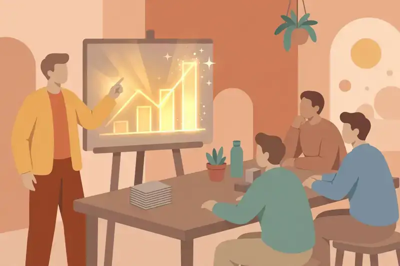
End every analysis with a recommendation. "Here is what the data says, and here is what I think we should do." Analysts who recommend get invited back. Analysts who dump charts get ignored.
Lesson 12
Analysis exists to serve decisions. Before you start, name the decision: "If the data shows X, we will do Y." If nothing would change regardless of the answer, skip the analysis. Curiosity is wonderful, but business analysis without a decision attached is a hobby.
After the decision, keep measuring. Did the change work? Compare before and after, watching out for all the traps from this course: small samples, missing comparisons, third factors. The loop of decide, measure, adjust is the whole game. One loop beats ten reports.
Graduation
You start with questions, distrust lonely averages, separate correlation from causation, respect sample sizes, chart before concluding, compare everything, watch for invisible losers, demand base rates, clean before calculating, keep models simple, present one insight, and tie it all to decisions. That is data analysis. No degree required, just discipline and curiosity.
Get certified
Prove you know it. Earn your Data Analysis 101 certificate.
10 questions. Score 7 or more. $5, yours forever.
Keep learning
This course is part of Starvard University, striving for greatness.
A note on accuracy: Much of what you read at Starvard was created with help from AI agents, working alongside people. We check what we can, but we cannot guarantee that everything here is true, current, or complete. If something really matters, your health, your money, a grade, a job, please verify it with a trusted source before you rely on it.