 Starvard
The Starvard Template: What We Think a Well Designed Website Looks Like
Every website is an argument about what matters. Most of them argue, loudly and all at once, that everything matters: the popup argues with the sticky bar, the sticky bar argues with the cookie notice, fourteen fonts argue with each other, and somewhere underneath all that arguing is the thing you actually came for, loading slowly.
At Starvard we have built hundreds of pages now: 280 courses, a library of 649 classics with more than twenty thousand chapter pages, a blog, tools, a store, whole universities in sixteen languages. Somewhere around page five hundred, a pattern became impossible to unsee. The pages people finished, shared, and came back to were all designed the same way. The pages that quietly died were designed every other way. So we did the obvious thing, late: we wrote the pattern down, gave it a name, and built a demo page that is the pattern, live in your browser.
This essay is the thinking. The demo is the proof. Both are free, and the template itself is yours to steal, which we will get to.
What most websites get wrong, in one paragraph
They mistake decoration for design. Design is not what a page looks like; it is what a page makes easy. Finding the point should be easy. Reading to the end should be easy. Trusting the people behind it should be easy. Leaving should be easy too, which is why honest pages never trap you: no exit popups, no countdown timers, no pre-checked boxes hoping you will not notice. When a page makes those four things easy, it tends to look calm and confident, the way a well run shop looks calm. When it makes them hard, no amount of gradient can disguise the smell.
Color with a job
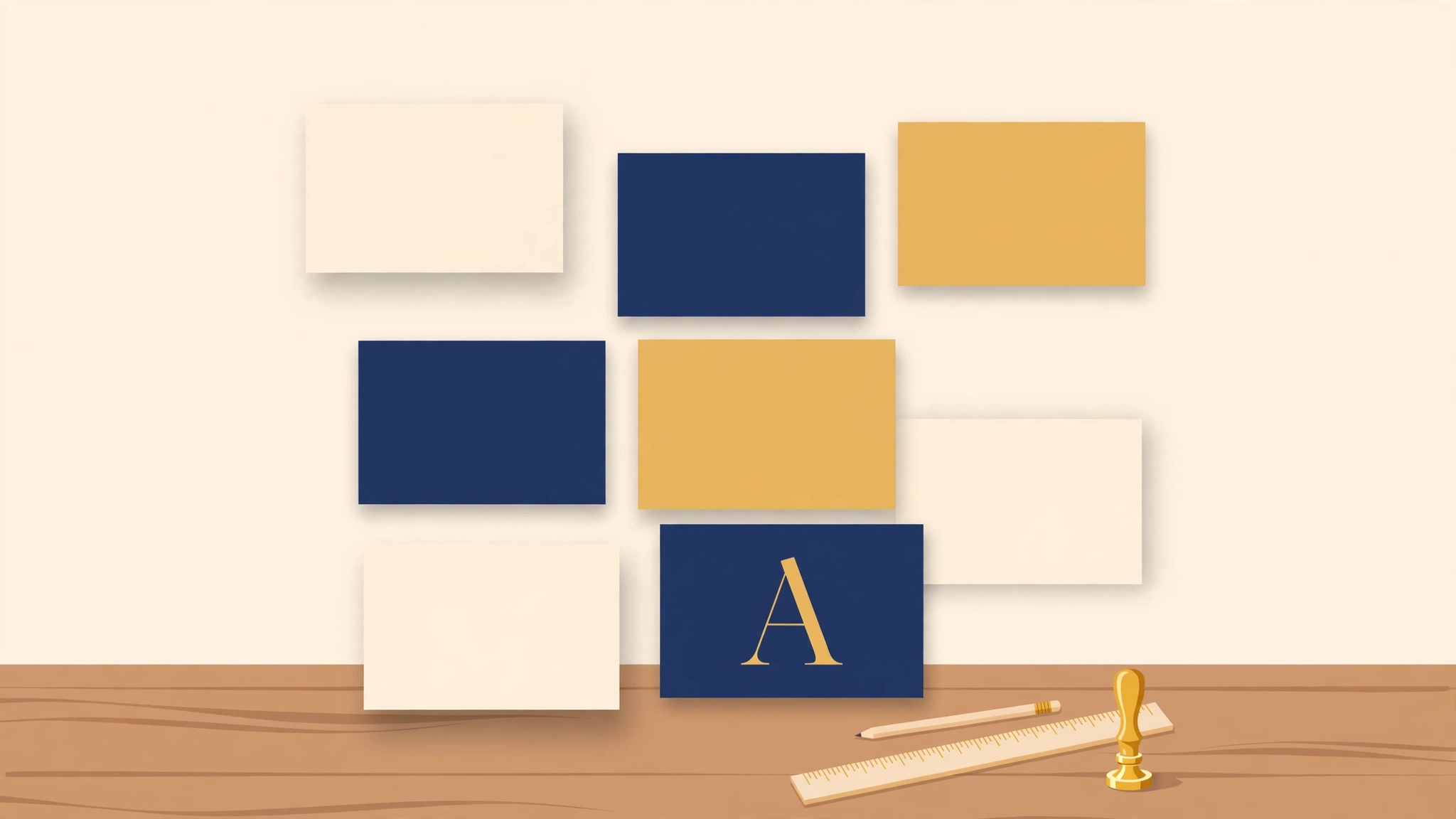
The template has essentially two colors. Navy (#16233F, deepening to #0E1830 in the footer) carries structure: headings, buttons, the frame of the house. It is the color of ink, uniforms, and institutions that expect to be around in fifty years. Gold (#B58520, softened to #E8D9B0 for borders and quiet fills) marks value: the one action that matters, the eyebrow label, the callout border. Everything else is paper: white, and ivory (#FAF7F0) where a surface should feel warm instead of stark.
The discipline is the point. Gold appears, on a typical screen, a handful of times. That scarcity is what makes a reader's eye obey it. The moment a design uses its accent color for decoration, it has spent the only spotlight it had. Our rule, printed on the demo page where our own designers cannot dodge it: one gold thing per screen.
Two voices of type
Starvard speaks in two voices and no more. Georgia, the serif, is the voice of the soul: it sets long reading and carries the warmth of a printed book. The system sans, whatever your device already speaks (San Francisco on Apple gear, Segoe on Windows, Roboto on Android), is the voice of the machine: buttons, labels, navigation, anything you tap. Headlines use the sans when they must be understood at a glance and Georgia when they must be felt; the demo page shows both, side by side, at their working sizes.
There is a practical sermon inside this choice. The template downloads zero webfonts. Nothing blocks the first paint, nothing swaps mid-read and shoves the text around, and the page works identically in Denver and in a village with a borrowed signal. Every site that ships you three hundred kilobytes of typography before a single word is taxing its poorest readers the most. We decline.
Space is the design
Underneath the colors and fonts, the template is mostly a rhythm: one idea per section, generous air around it, a stage 1,140 pixels wide with margins on both sides, sections that begin with a small gold eyebrow saying what category of thing this is, so the headline is free to say the interesting part. Compare a page that does this with a page that stacks twelve competing claims edge to edge. The information can be identical. The experience is not: one reads like a lecture from a person who knows the material, the other like a market stall at full shout.
This is also why our navigation scrolls away with the page. A sticky bar is a permanent tax on every line of reading, paid forever, to save an occasional scroll. We tested ourselves: readers find the top again just fine. Your place on the page is yours, and the template refuses to stand on it.
Speed is a feature, maybe the feature
Our house standard is a page that feels instant: three quarters of a second end to end, half a second on a good day, measured the honest way, on the visitor's own screen. The template is how that standard is achievable by ordinary pages rather than heroics: system fonts, images in WebP sized for their slots and lazy below the fold, no JavaScript framework standing between the reader and the words, semantic HTML that reads correctly before a single script wakes up. Speed is not a technical vanity metric. Speed is respect, denominated in the only currency every reader spends the same way: attention.
Honest by default
The last piece is the one we care about most, and it is a design decision like any other. The template prints its caveats where they belong, in the open: prices in plain words, limits stated before you hit them, and an accuracy note in the footer of every page on the site, because a university built with AI help owes you that sentence. Our own store once tried to sell a certificate with the word accreditation floating near it; we pulled it, in public, because the template's first principle outranks any single page's conversion rate. Interesting first, honest always: a design system that cannot say no to its own marketing is not a design system, it is a costume.
Steal this template
The demo page at starvard.org/template includes the full specimen set (colors with their hex values, type at working sizes, buttons, the gold callout, the stats band), the list of rules we refuse to break, and a starter skeleton you can paste into an empty file and have a Starvard-shaped page in minutes. View source and take the whole demo, if you prefer; it is built to be taken. Use it for a business, a church, a band, a university of your own. Credit is appreciated and never required. The fastest way to spread good design is to stop hoarding it.
If you build something handsome with it, come show us. The Commons, our Discord, has a standing invitation for exactly that, and the kindest critics on the internet.
Why this belongs at Starvard
Starvard's wager is that the internet's best things should be free, legible, and kind, and that a free university proves it by its own conduct. A design template sounds like a small thing to give away, until you count what it touches: every course a student in Lagos or La Paz will ever read here arrives through this layout, at this speed, under this standard of honesty. Publishing the template, with the reasoning attached and a demo anyone can inspect, is the university practicing in public what its web design course teaches. The campus is the curriculum. Now it is yours too.
Sources
Dieter Rams, Ten Principles for Good Design, published by Vitsoe (vitsoe.com): the grandfather text of restrained design, including "good design is as little design as possible," which our color discipline borrows shamelessly. The GOV.UK Design System (design-system.service.gov.uk): proof at national scale that plain, fast, accessible pages serve everyone better. web.dev, Google's web performance guidance (web.dev): the measurement culture behind our speed standard. Our own Web Design course at Starvard, where Henri teaches the craft this template packages. And the demo itself, The Starvard Template, which is the only source that matters: go look at it.